| |
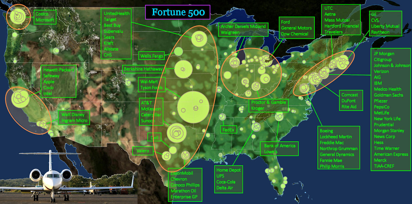
Profit Extraction Centers The map above shows the location of Fortune 500 corporations in America in 2010. The size of the green circles is proportional to annual revenue. Giant firms are concentrated in a dozen or so major cities (inside ORANGE ovals). Most are on the East Coast, but the largest individual players are located in the middle of the country, and on the tech-heavy Pacific Coast. |
| |||||||||
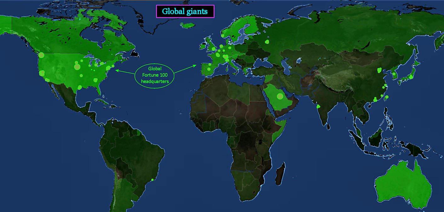
Global Competition The circles on the map above indicate profits (not revenue) of the world's 100 largest corporate giants in 2010, which again are clustered in just a few cities. It reveals that, although American GDP is roughly equal to that of China (and to that of Europe taken as a whole), America's share of yearly corporate profits nearly equals that of the entire rest of the world, combined. While America has lost most of its industrial capacity, it excels at controlling the flow of wealth. | |||||||||
| |||||||||
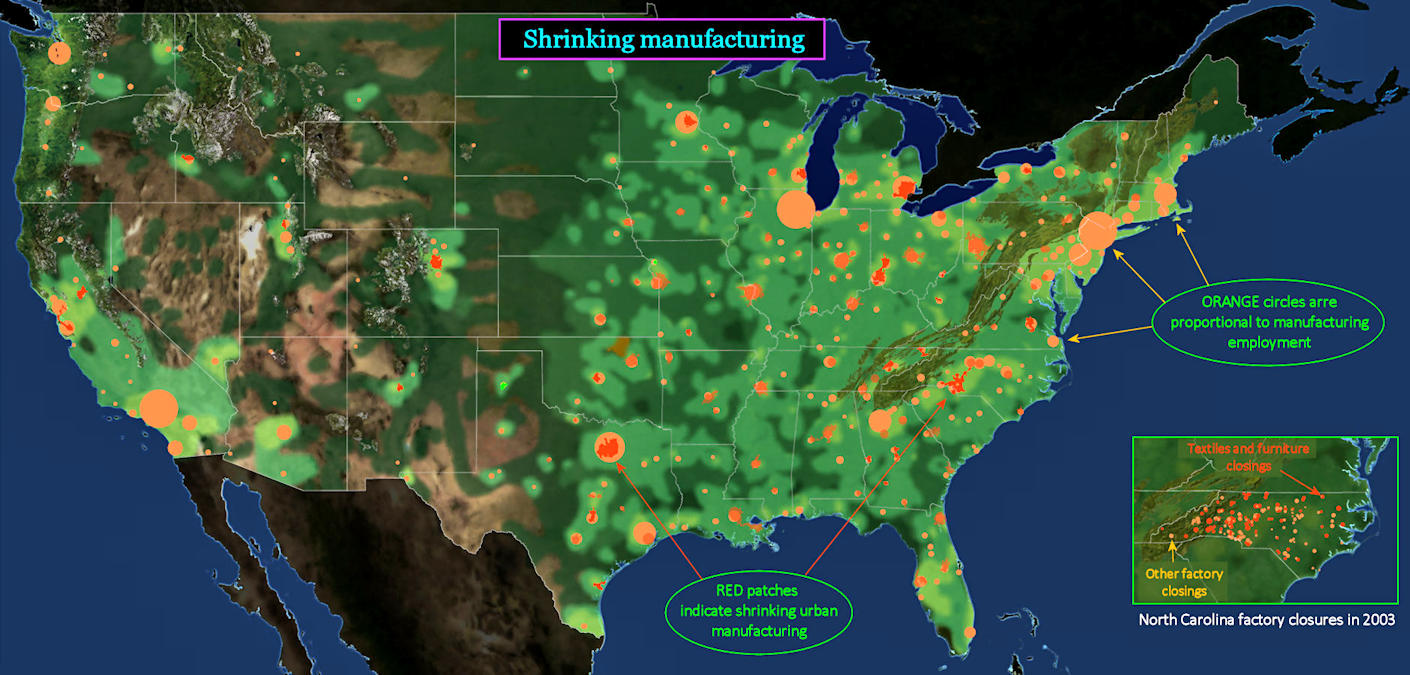
Offshoring This map indicates that there are still plenty of things being made in America, despite the 'offshoring' of most heavy industry to Asian countries, where labor costs are much lower. Manufacturing sites that remain have mostly moved out of the city, and into suburban industrial parks, where land is less expensive. RED patches on the map indicate urban areas that lost manufacturing jobs during the preceding decade, in a process likely to continue. | |||||||||