| |
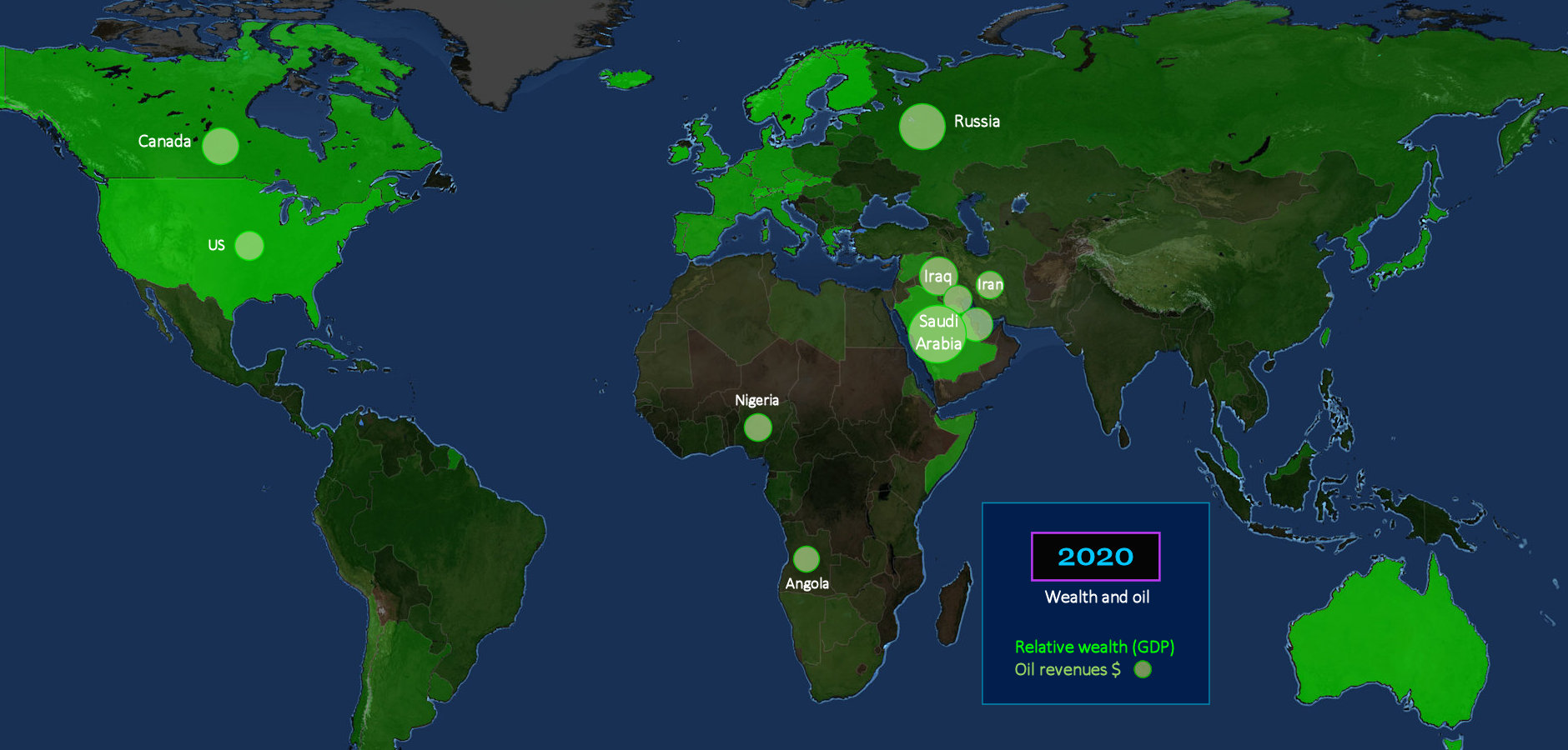
Haves and Have-nots The brightest GREEN areas are the wealthiest, as measured by per-capita GDP. The LIGHT GREEN circles indicate yearly income produced by oil and gas exports. The US is not even among the top five, while money from oil and gas production is literally flooding into the Middle East, and Russia. The US is actually the world's leading oil producer, but relatively little is exported, so little new oil money is flowing in. |
| |||||||||
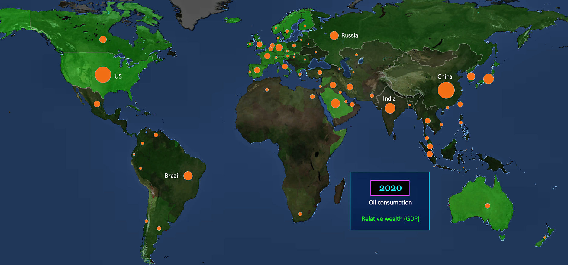
Oil Consumed Statistics about oil are confusing, because there are several different measures, with wildly different numbers. The map above shows oil consumption, which is oil burned within each country for heating, transportation and industrial activity. The US and China are the current champions, by this measure. | |||||||||
| |||||||||
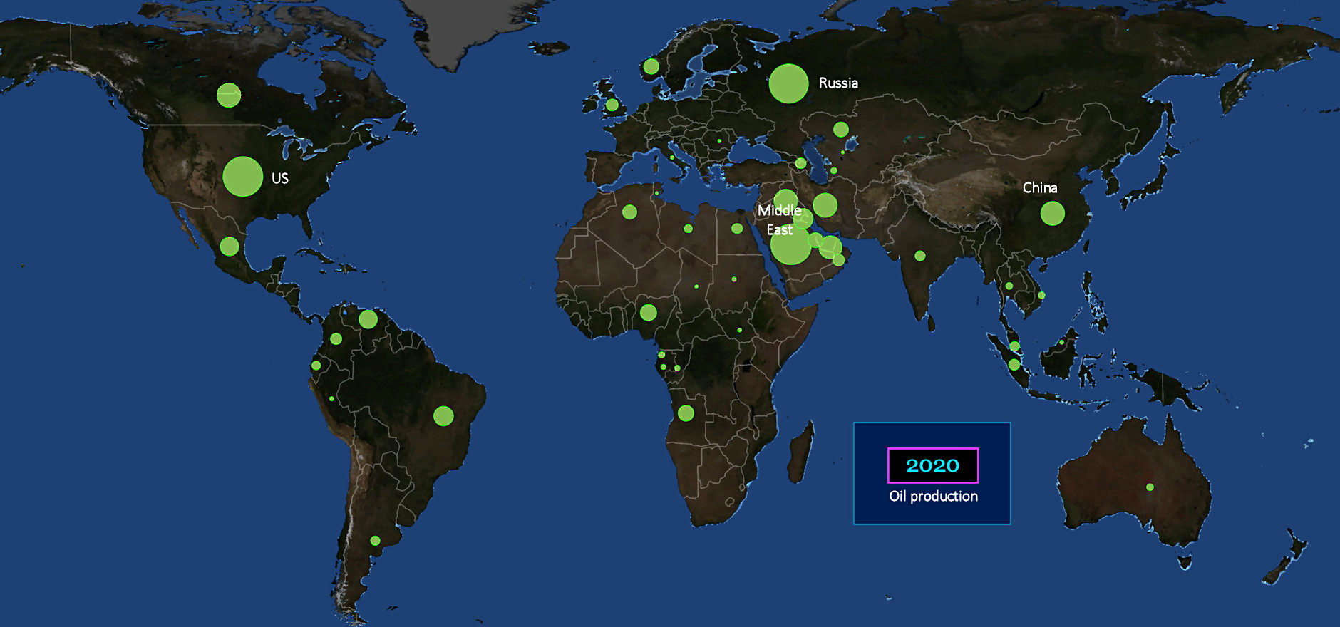
Oil Produced This map shows how much oil is produced. It looks similar, although the Middle East is far more dominant, but still masks the really important number (revealed below). | |||||||||
| |||||||||
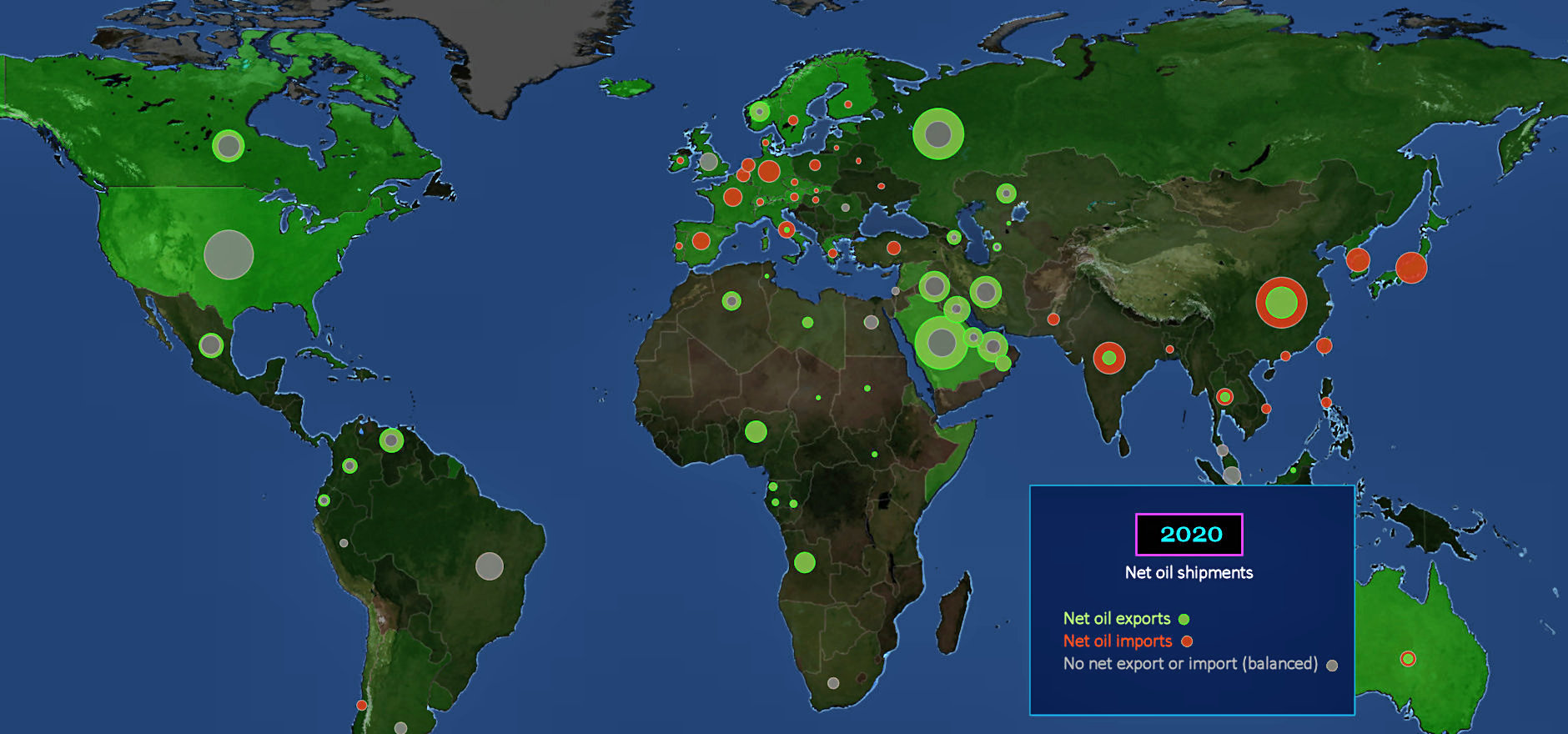
Net Oil Imports This is the map that matters, showing net oil imports. The amount of RED indicates the extra oil that must be imported to meet needs. These are countries being continually drained of resources, solely due to energy needs. Europe is almost solidly RED, while all the industrial countries in Asia are also being drained by the need for imported oil. Countries with GRAY circles, like the US, are basically balanced, producing enough to meet their needs. Those with GREEN rings have extra to sell. This is gravy. | |||||||||
| |||||||||
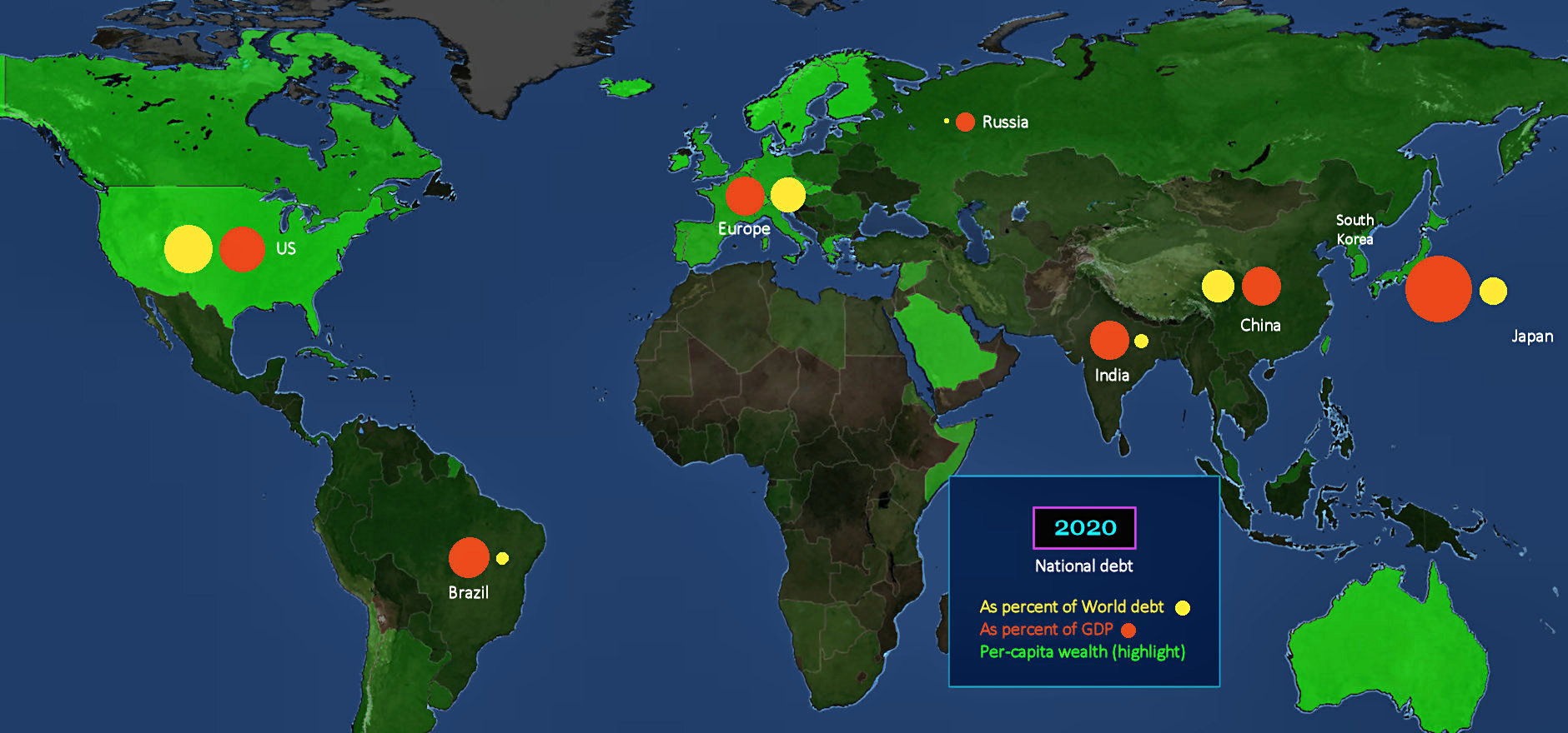
Debt Here are three very different indicators of wealth. The GREEN highlights indicate per-capita GDP (which doesn't include debt). By this measure, the US tops the list of major industrial countries, which is good. The YELLOW circles indicate national debt as a percentage of total world debt. The US is again at the top, but this is definitely not good. The RED circles indicate national debt as a percentage of GDP, where bigger is again worse. Only Japan is in worse shape, by this measure. | |||||||||
| |||||||||
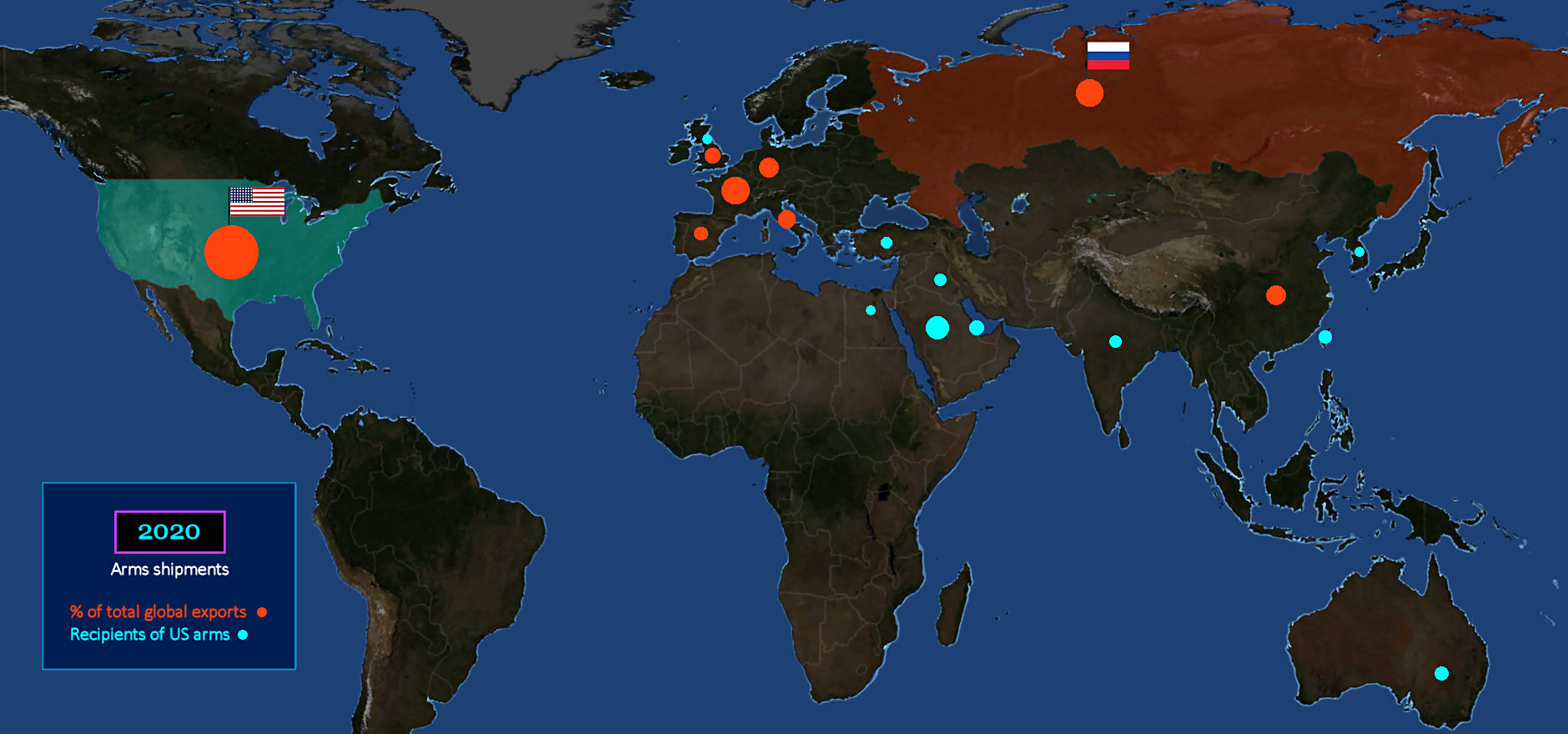
Arms Shipments It's easy to blame Russia for funding foreign conflicts, but the US is far ahead in terms of actual arms sales. The RED circles indicate the percentage of total world arms shipments from each country. The US far is in first place, by a country mile, with Russia and France tied for second, at about one-quarter of the US level. The BLUE circles indicate recipients of US arms exports. Saudi Arabia gets about 20% of all US arms shipments, although it buys all its missiles from China. | |||||||||