| |
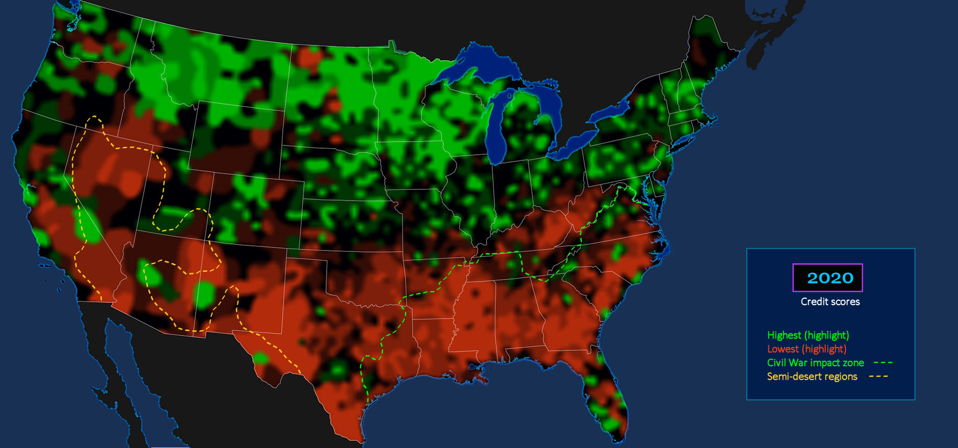
Depressed Regions GREEN areas on the map indicate the most prosperous regions, as indicated by high credit scores. RED zones, with lower scores, are largely confined to former-Confederate states in the South, plus desert areas in the Southwest, and Texas cattle country. Prior to the Civil War, almost all southern wealth was tied up in slaves, but was lost when the slaves were freed. The South has never fully recovered. |
| |||||||||
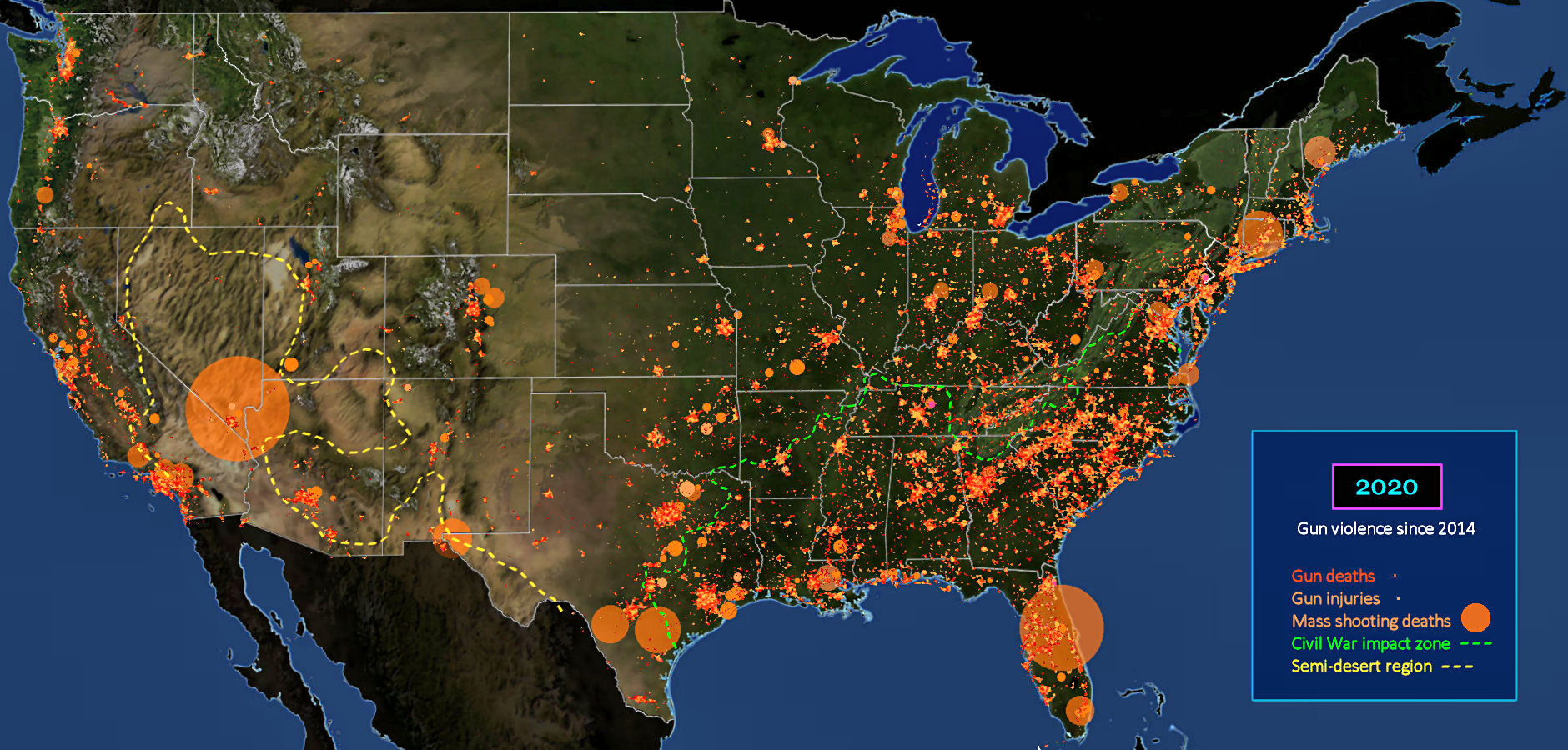
Southern Legacy? The map above shows 15 years of gun violence. One might expect this to be randomly scattered, but the zone below the GREEN (Civil War) dashed line shows a higher density of incidents. This is despite the fact that population density is only two-thirds that of northern states, above the line, where most urban areas are located. The cause of the pattern is unclear, but a link to depressed economic conditions seems plausible. Dramatic mass shootings are also more common in the South. | |||||||||
| |||||||||
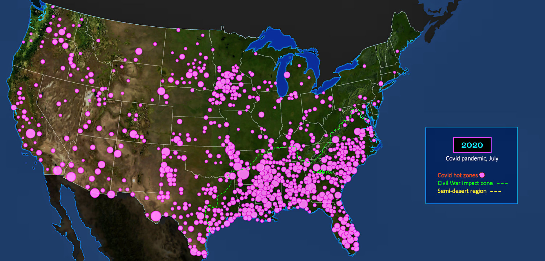
Vaccine Resistance This map shows 'hot' areas for new Covid-19 infections, four months after it was first detected in New York. The crisis in New York is already subsiding, but look at the Southern states below the GREEN (Civil War) dotted line. Americans today widely blame the Biden administration for its mask mandate, but look what's happening in places where this mandate is largely ignored, like the entire Deep South. Population densities are relatively low throughout this region, but the new infection rates are totally out of control. | |||||||||
| |||||||||
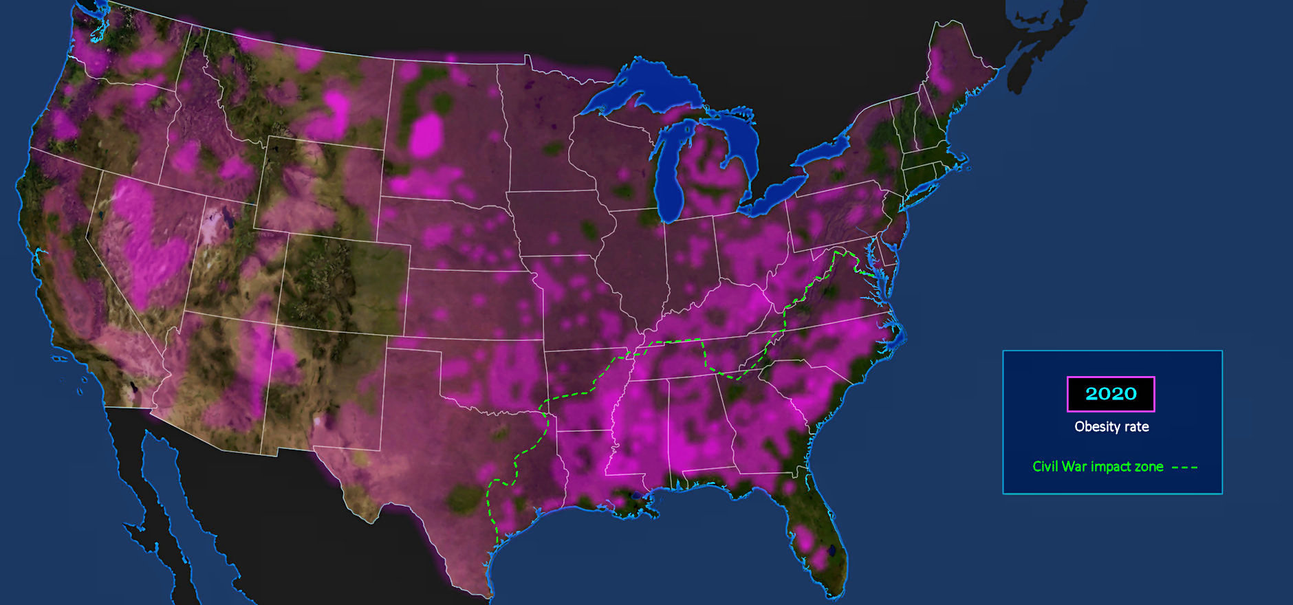
Health Risk This map is from 2010, but the overall pattern changes very little over the next 10 years, while the obesity rate triples. One-third of American adults are now considered obese, and a rising percentage of grade-school children, often eating school lunches. Fast food and sodas are cheap and filling, and widely available everywhere, but full of sugar and empty calories. The hot zone is again below the GREEN (Civil War) dotted line, where economic conditions are relatively depressed. | |||||||||
| |||||||||
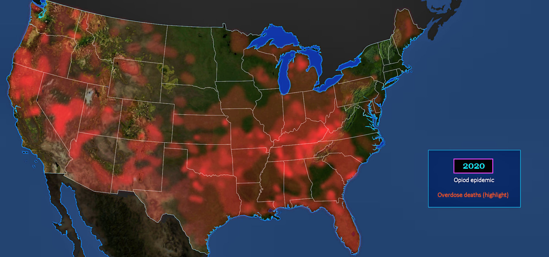
Overdose Epidemic The opioid epidemic in America has been gaining a lot attention, due to recent lawsuits, but actually got its start back in 1995, when Oxycontin was first introduced. That's the same year the internet was born. A massive, and highly deceptive marketing campaign fuels the epidemic of addiction to the drug, which is essentially just a time-release version of Heroin. Overdose is a common result. Users who are originally drawn to its powerful anti-pain properties, find they just can't quit. | |||||||||
| |||||||||
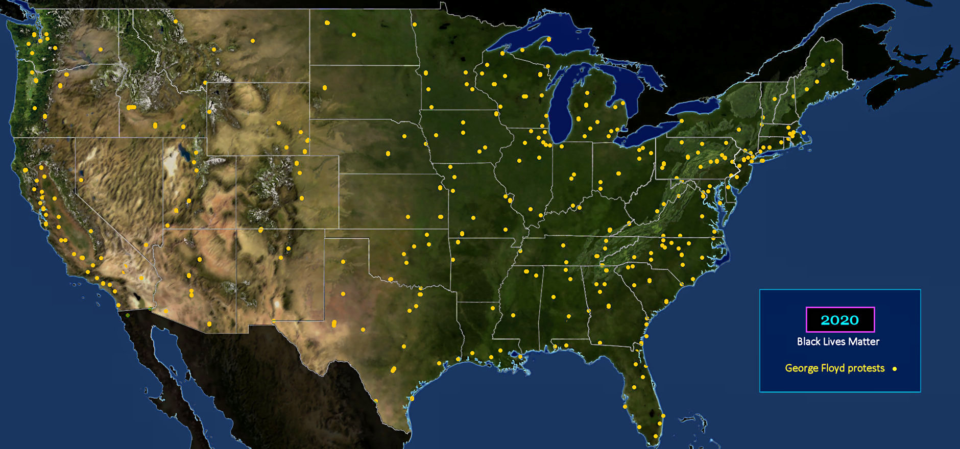
Police Brutality This map shows the location of protests erupting after the public police murder of a fully-restrained Black, suspected of purchasing cigarettes with a counterfeit $20 bill. What makes the relatively evenly-spaced distribution pattern so striking, is that it doesn't show any North-South skew. This, despite the fact that it is largely a reaction to local patterns of unarmed Blacks being killed by police. Southerners may be less tolerant of Blacks than others, but police everywhere continue to target them for violence. | |||||||||