| |
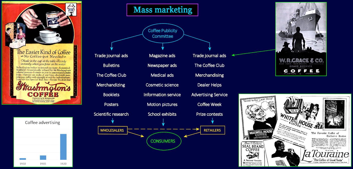
Organizing the Campaign The chart (lower left) shows the rapidly-growing dollar commitment to this campaign. Three different 'offensives' are designed to flood the consumer with publicity. The Life Magazine ad (top left) and newspaper ads (bottom right) are aimed directly at consumers. The other two prongs of the attack target the distribution networks involved in getting products onto store shelves. |
| |||||||||
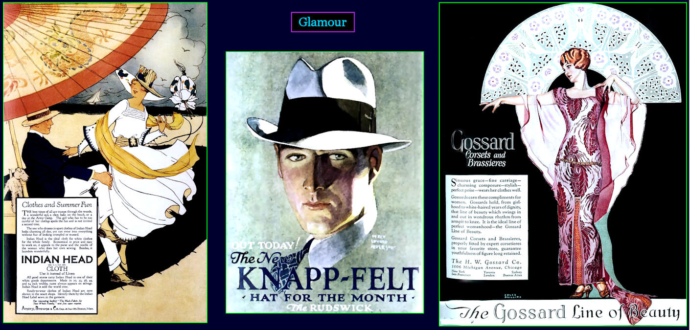
Juicing it Up Splashy ads often feature color. This is brand new, made possible by advances in color printing techniques that are still being developed. But color illustrations lose quality when printed on existing equipment. For this reason, color is mostly reserved for magazine covers (inside and out, front and back) and posters, which are printed separately, on better paper, with the best equipment. Advertisers actually prefer less expensive black-and-white for most advertising, since it reproduces better on the printed page. | |||||||||
| |||||||||
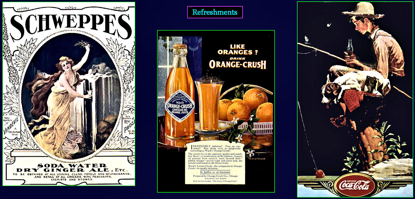
Simple Pleasures Beverages promise a more enjoyable life at little cost. Anyone can afford a Coke, even out on the farm. Artwork for the ad at right was created by Norman Rockwell, the most popular illustrator of the time. | |||||||||